How to change a suggested pronunciation

In Cantonese, there are many cases where there is ambiguity in how a character should be pronounced. Jon tried to make a best guess at what most people would try to say, and put that suggestion into the font. What if it is wrong?

As an example, let’s look at a phrase 小明話佢做晒功課喎, which in version 2.0.21.0 is shown as

with a wo3 assignment for 喎. The phrase then means “But I heard that Ming says he finished all his homework”.

If the same character, 喎, is pronounced as wo5, the phrase means “Ming says he finished all his homework, but I don’t believe it”. What if you want to show this second usage?

To override a reading, append .jyutping after a character.

In this case, if you type .wo5 at end of the sentence, the appearance will then transform:

The sounds available for each character are exhaustive; if you tried a jyutping and it doesn’t work, it is more likely than not that it is not a possible jyutping for that character (e.g., you are trying to override 曰 with jat6, not realizing it is the character for “to speak” instead of “sun 日”.) In the future (probably summer/fall 2024), I’ll provide a web-app for you to query what sounds are available for a given character. In the meantime you can ask me.

Exceptions

There are cases where you typed the .jyutping and nothing changes. Yikes. Like this:

You’ve added the right jyutping, and bewilderingly it stays as soeng5.

What happens in these cases is that the word 上落 binds very strongly, and the reading there is tone-5. What you can do is instruct the font that 天上 is a concept, and 落雪 is another one. This is done by using a | (pipe/bar; on US keyboards it’s above the return/enter key):

This is called segmentation, and means “breaks this up because of a word boundary”. This process is a standard step in lingustic works for languages that does not use space as a word separator, and is more generally useful than just coercing a pronunciation, as this now provide more information about the text. You can read more about this markup system here: .

Super exceptions

There is a theoretical possibility that you want to split what the font considers as a word, you agree that it is a word, and you are thus philosophically opposed to using the | markup since it would mean it’s not a word. (I know, I know.) In these rare cases, you can use the \ backslash marker, which is intended to mean “break this up forcefully for no stated reason”. Use this sparingly and only when you must.

1 Like

about the 上 ,it seems that we can’t change its pronunciation on keynote.


How could we fix it?

You are seeing a Keynote bug. First the fix, then why.

Fix

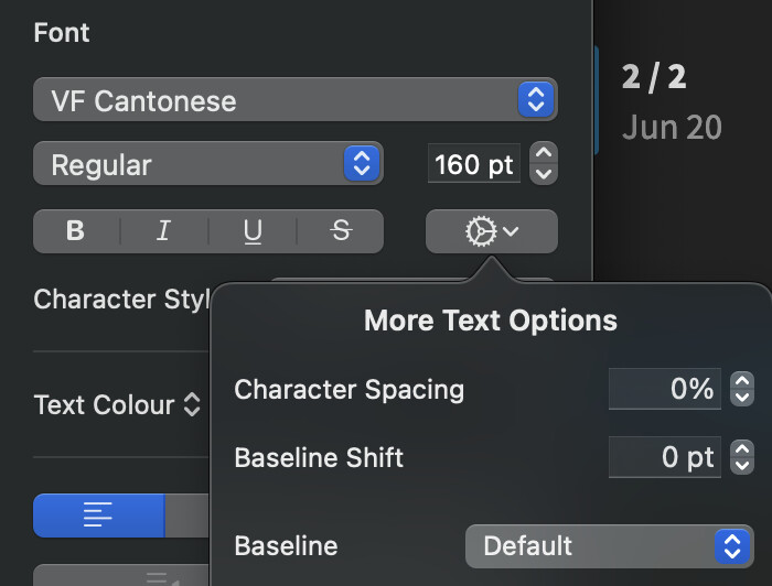
  1. In the Format → Text inspector tab, click on the gear-wheel to open the character options.

  2. This is probably 2% character spacing. TYPE 0 in the character spacing box. You cannot use the up-down arrows.

Ligatures should now work; and you will not need to override, since 上山 becomes soeng5 contextually, without any work on your part.

Why this happens

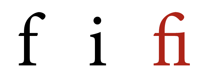
Contextual pronunciations uses (abuses) a mechanism called ligature. The original purpose of ligatures is for Latin character combinations that clash together (like f + i) to be replaced by a new symbol (fi). Given this purpose, ligatures behaviour when character spacing isn’t normal is simply… undefined. Apple interprets this as “we disable all ligatures”.

Now comes the fun part. If you use the up down arrows to set it to zero, ligatures still doesn’t work. Why? What happens is that the box shows you an integer, but behind the scenes it’s a decimal. It looks like 0% to the user when using the down arrow to bring it from 2% to 0%, but it’s actually rounded to something like 0.0003%. Since this is still “not zero”… no ligatures!

Typing the value in sets this to zero.

(An Apple dev, who is also a user of the Canto Fonts, discovered all this. He has brought this 0%-is-not-0% issue to the Keynote team for fixing.)

Edit: this 2% character spacing is from the Title style in the presentation template. Normal textboxes do not need this.

Thanks for your detailed explanation. It works now! :raised_hands:t2:

Can we change the Jyutping? For example, instead of having 魚 pronounced as “jyu2” or “jyu4,” I want it to be pronounced as “zyu1.” Is this possible?

Do you know WPS? It has a function that allows users to change the pinyin. Could we have something like this?

I might be asking too much. :sweat_smile: Just a whim

Can we change the Jyutping? For example, instead of having 魚 pronounced as “jyu2” or “jyu4,” I want it to be pronounced as “zyu1.” Is this possible?

This is not possible with the Fonts. In the font, every character+jyutping combination needs to be drawn ahead of time. And every reasonable Cantonese pronunciation had been included; if you find ones that haven’t, please report in the “missing / errors in Jyutping” thread.

Maybe this is possible for the typesetting / app options, but supporting non-Cantonese uses is beyond the scope of this project and not a high priority.

1 Like

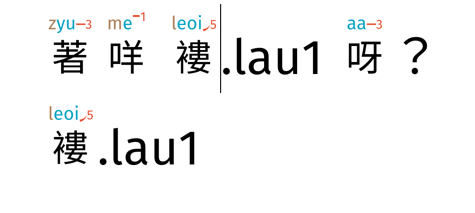
Hi!I tried 褸 lau5 on LibriOffice, but it didn’t work.
I also checked character spacing and it was 0%.
WechatIMG284

Is there anything I can do to fix the problem?
Thanks!

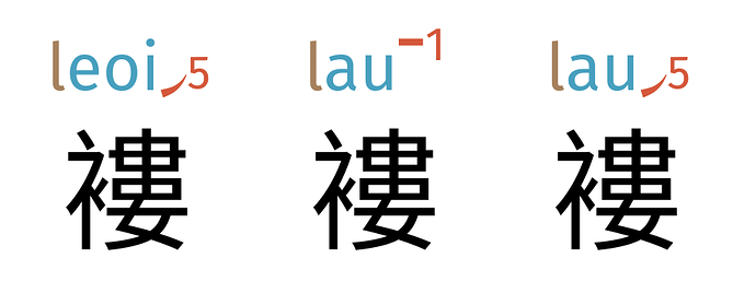
There are three permissible pronunciations for 褸:

LibreOffice cannot interpret .jyutping syntax. The immediate general workaround is to use a word processor that does support this (e.g., Pages).

In this specific case, users are most likely to use 褸 the same way as you are using; in 2.8, I will change the standalone reading to lau1. That release is likely around mid-July. (I have additionally added (金)褸衣 to the word-list for 2.8, where 褸 takes on lau5.). Thank you for your report.

The future general solution is for me to push forward on the companion app, that provides a copy-to-image option from a web interface. There is a technical proof-of-concept:

The full solution is non-trivial and its development would likely take several months.

Edit note: why is this challenging for font renderers? Ligatures, in general, were aesthetic devices such that characters that otherwise clash; it replaces two glyphs with a new one. Note that it is not possible to color only the f in the new fi ligature glyph: it is one shape.

Font shaping and rendering is hard. Not only does it need to take care of global scripts (which are not all conceptually linear), but it must also be extremely performant to the extent that potato computers still should be able to render thousands of characters 30 times a second.

Many shaper-renderers thus make their jobs easier by first breaking apart by script (e.g., Arabic) and language (e.g., Urdu). The assumption is that if they are two different languages/scripts, there must be no interactions between them. This is not a bad assumption.

However, Cantonese Font — in particularly the .jyutping notation — breaks this assumption. When we type 褸.lau5, we are actually providing it with a sequence of mixed Chinese and Latin characters. The font shapers that assumed no interactions between languages — like that used in LibreOffice — will start the rendering process by breaking 褸.lau5 into Chinese and Latin .lau5 and render them one after another. The rule I wrote for 褸.lau5 thus never gets triggered.

1 Like

Thank you so much for your detailed reply! Really love what you’re doing. It makes my Cantonese learning so much easier!

Another trivial question: my Cantonese teacher used 騰騰震 (tang 4 tang2 zan3), but I have a little trouble changing the second 騰 to the 2nd tone. It seems like 騰 usually has 4th tone, but maybe colloquially, there is variance. Also found that if I type just 騰騰震 directly, it’s tan4 tan4 zan3. I’m not sure which one accurate.

These are excellent feedback. Please keep them coming. I’ve added both 騰騰震 / 揗揗震, as tone 2, to corrections for 2.8. My apologies for the tone 2 glyph omission — there are no ways for users to create glyphs that does not already exist, and are thus my highest priority for additions.

In Cantonese, tone-changes are not standardized. These two (one) words, for example, can be pronounced either as tan4 tan4 or tan4 tan2 depending on usage (see entry in Words.hk for examples.) These tone changes don’t really follow any rules and aren’t recorded in dictionaries, so their discovery is largely case-by-case.

1 Like

Thanks again for your prompt response!!

1 Like

A few more words:

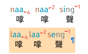
I had to leave space in between to create naa4 naa2 seng2. It doesn’t allow me to change directly (see the highlighted example).

image

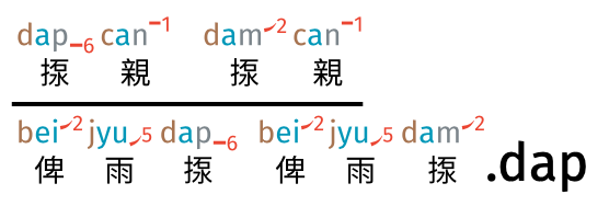
Another one is dap6 can1, it doesn’t automatically generate dap6.

image

bat1 nau1 doesn’t have nau1 but only have lau1?
image

lai4 嚟 only has lei4?
image

Fix first, theory later.

Fix

Case 1, 3, and 4 are interesting and somewhat exotic cases where

  • a character has a default that you want (e.g., 嬲 as nau1)
  • AND a ligature override it (不嬲.lau1)

You have exactly the right intuition here in introducing a space to break them apart. This, of course, doesn’t look right!

Canto Font anticipates these cases, and provide a symbol \ (backslash) that acts like a space for breaking up ligatures but do not actually take up any space. So for example, if you want 不嬲nau1, you can add \ between 不 and 嬲, like this: 不\嬲.

As to changing the default to nau1… in this usage, Words.hk, Wiktionary, and my personal usage are all non-nasal. 不嬲 is conventionally read with L and not N.

Why

The font works (simplified) by “whenever you see 不.bat1 followed by 嬲.nau1, swap the 嬲.nau1 for a 嬲.lau1”. When you use the .jyutping mechanism to coerce a 嬲.nau1, what you have done is actually still ensuring the rule should apply. The font doesn’t know how 嬲.nau1 came into play; the font just know the sequence is there. There’s no cleaner mechanism here, sorry.


Case 2 揼 is properly dam2 (from “dump”), and dap6 (to strike) is a possible modern usage. Cases where the context is unambiguous, I can provide dap6 (e.g., 揼石仔). In the case of 揼親, it could plausibly be 佢被人揼.dam2親 (he got thrown) or 佢被人揼.dap6親 (he got beaten up). There isn’t a solution that would work better.

1 Like

Thank you very much!! Appreciate the help!!