Discussion on 2.3 (March 2024)

I passed on ultra-early-access of Pokfield to five testers, who are existing users, or on the Words.hk team. In one week, I’ll open up access to more testers.

Packaging a new release take time and manual attention (about 3 days); I’ll be doing two more releases (end-of-March, end-of-April), before the font’s general public availability on May 15.

The current version is feature-complete, but could be better. Please do not re-distribute.


About 2.3

Notes about this version can be found in this thread: Cantonese Font v2 - Development Roadmap & Status - #12 by jkwchui

In the next week (before admitting more general testers), I’ll be writing up / filming a short tutorial about the font and its features.


Testing focus for 2.3 series

Platform / app compatibility

In crafting Pokfield, I take “what should be possible with fonts” from the specifications, and push it to the utmost. Font rendering is very complicated, and most renderers do not seem to respect all the built-in redundancies.

The following test string uses many of the Pokfield features:

我喺{Shek Kip Mei}[個 x 1]|英\文.man4老師|叫|[陳大文 n]|。
{idiom: 1}
jyut{tone 6}
昨夜見軍帖,可汗大點兵

By copying the text into the application you are using, and applying an Italics style to 昨夜見軍帖,__大點兵, you should see the following:

Mac/Keynote

You should specify the operating system / application, and I strongly suggest posting a screenshot similar to the above along with your comment. It is very valuable if you can help discover the usability of all four variants (which is generally easily done by changing the font several times).

[TODO] May need a template for compatibility testing

Pronunciation errors

The core offering from the font is accurate Jyutping, so I am always interested in making it better.

At the moment, pronunciation errors generally come from one of two classes of “mistakes”:

  1. the font does not have a particular context (e.g., in 2.3.0 it doesn’t yet have xx會, so 路得會 would have an incorrect wui6)
  2. “segmentation errors”: what is considered a unit of word is messed up. E.g., 天上落雪 may incorrectly have a soeng5, because the font is interpreting the phrase as 天|上落|雪.

You can help narrow down by providing the correct segments manually. (More in the article for broader testers that is incoming in the next week.)


Feature requests

Once you start using the font, you may find that there are convenience features you’d like the font to do for you. You are welcome to post them here too; they may fit into the font, or some supporting web-app.

Finally found a Windows app that supports the font well (the B/W version at least) :smiley:
(Affinity Designer doesn’t support color fonts at this moment:
Color Font is not being displayed in Affinity Designer 2 - Desktop - Affinity on Desktop Questions (macOS and Windows) - Affinity | Forum)

Windows / Affinity Designer 1:

1 Like

That both version of B/W works, on a Windows app, is excellent news. I looked at B/W prints for review, and in those 10-15 hours I felt that it was very usable too.

Let me think about what is the right way to do a thread about software compatibilities as y’all discover them. Am I correct that your reply also suggests that

  • Win / Word,‡
  • Win / Powerpoint,
  • Win / LibreOffice,
  • Win / Illustrator,
  • Win / InDesign

did not work with even the B/W version?

‡ I had (attempted to) add a flag for specifying the font supports Chinese.

Some features work, but some don’t. Will upload more screenshots from other apps after some more testing.

I tried to open ver. 2.3.0 in FontForge. It seems like Chinese is not included successfully :smiling_face_with_tear: (I selected “Simplified Chinese” and “Traditional Chinese” for “MS Code Pages” last time to make it work in Windows / Microsoft Word.)

Thanks for the heads-up re: “MS Code Pages”. Let me, in the future, try to edit that into the plain-text TTX.

I am relieved that something works in Win, but very unhappy that color is not an option. While awaiting other early tester’s feedback, and prepping some tester’s guide, I’ll allocate another 2 weeks to try other ways of getting color into Windows.

Windows / LibreOffice Writer:

圖片

  • :white_check_mark: Default Jyutping
  • :negative_squared_cross_mark: Changing Jyutping
  • Shorter {…} works, but longer {…} doesn’t.

Windows / Microsoft Word:

  • :negative_squared_cross_mark: Default Jyutping
  • :negative_squared_cross_mark: Changing Jyutping
  • :white_check_mark: {...}

Setting “Ligatures” to “All” is required to show all {...}. Otherwise, only shorter {...} works. Maybe {...} could be a workaround for Windows users to change default Jyutping?

Windows / PowerPoint:

圖片

  • :white_check_mark: Default Jyutping
  • :negative_squared_cross_mark: Changing Jyutping
  • :negative_squared_cross_mark: {…}

Windows / InDesign:

Mother of god. This is wild. :exploding_head: I am… shocked.

  • Word and Powerpoint interprets the same rules differently,
  • InDesign (global / CJK) interprets the same rules differently
  • LibreOffice ate parts of a rule (??!). 個, for example, has a rule that is x 1] but somehow it took the ] but not the other parts.
  • Word somehow works for ligatures but not standalone text (??)

Let me push forward on some of the COLR experiments, but given it’s the features that are broken erratically on Windows, I’m not sure that (outside of Affinity Designer) it is salvageable.

Edit: Powerpoint is famous for not having any OpenType feature support. It’s astonishing how much better craftsmanship the Keynote team have.

The 2.3 files have been replaced by a new version that has the Microsoft-specific codePages set for Traditional/Simplified Chinese. This should make them more usable on Microsoft software.

:smiley: It works now.

Windows / Microsoft Word:

But when typing Cantonese-specific characters (e.g., 喺, 嘅, 啲), the font will be switched back to the default Chinese font. Have you included 951 for code pages, too?

(Source: Windows code page - Wikipedia)

Font Wars from thirty years ago yet haunts us today. Glyphs do not provide access to 951 code pages but this should be a easy fix. I’ve opened an issue with them. (I also decompiled the .ttf and attempted a manual intervention; but the flags are not what I expected at all.)

I am still perplexed that some-but-not-all of the features are active. I suspect that

  1. either the Microsoft font renderer does not respect a ligature that begins with characters in the extension plane:


:point_up_2:this works

:point_down: this doesn’t

  1. or it has some upper-bounds other than the 2^32 that is in the OpenType specs.

The former is far more likely. The ligature {zoom} is the rule that immediately precedes 一.jat1mapping to , and while the former works, the latter doesn’t:

I’m not sure who to raise this issue to, and have sent a generic “feedback to Microsoft”. I am not expecting to hear back from them; if anyone has inside contacts you should hook us up.

(For the curious… the decompiled file runs 15,499,142 lines.)

I checked 2.0.21 again. The font actually works for Cantonese characters after adding 936 and 950. Maybe because of some other settings? :exploding_head:

圖片

I came across the following post. It seems that ligatures with different scripts won’t work in Chrome / Windows. :thinking:

Maybe a workaround for altered pronunciation on Windows could be typing the unicode instead of the Chinese character (e.g., uni5605.ge2 for 嘅.ge2)? But it will be less intuitive and requires checking of the unicode. And a lot of more rules are needed?

:open_mouth:

Great find. It seems breaking mixed scripts into separate runs by script/language is a common, and long-accepted procedure. I am not opposed to adding a codepoint.jyutping alternate handling, but would

  1. probably omit the uni and u (normal users don’t want to know that it’s uni4321 but u54321), and
  2. publicize the existence of this mechanism only when there is supporting web-app. A useful tooling would be for user to type/paste , and for the UI to show all the possible sounds, and when clicked on 嘅.ge2 / uni5695.ge2 copies that string into the clip-board (unstyled) for pasting. This awaits completing that rewrite of ExCanto and web UI.

Also reporting back that COLR/CPAL is a no go. Technically COLR is implemented by breaking up each colored glyphs into layers, and placing each layer into its own glyph. The 38,000 CJK glyphs, each with 5 colors, blows up into more than 65,535 glyphs and simply will not work.

You mentioned phantom characters before. Would it be possible to have two layers/times of ligature like this:

  1. .ge2 :arrow_right: phantom Chinese character (or convert each Latin letter or number to their own phantom Chinese character which look the same as the original Latin letter or number, just to fake the renderer that they are all Chinese scripts)

  2. 嘅ge3 + phantom Chinese character(s) :arrow_right: 嘅ge2

Phantom glyphs, sadly, counts towards the cap. The font is already banging against the ceiling on the number of glyphs side; from my memory there are about 6,000 jyutping in play, which means 6,000 .jyutping phantoms. We don’t have that.

The “convert each letter/number/syntax-symbol to their own phantom” is really clever. I think it has life. The drawback is that introducing the extra layer would greatly complicate writing and maintaining the rules; they are dirty to read right now and adding one layer of misdirection would prob make them not readable for humans.

Let me marinate on this; my current feel is that this is something to do a few months after release, when everything had been ironed out and we can be confident that we will rarely go back to edit rules.


Above is from libreoffice using VF Canto v2-3-0 Standard Jyutping

2nd is from Microsoft Office, same font. Both are using Windows.

I see that you’re using VF Canto v2-3-0 Standard Jyutping, which seems to be the color version (from the color folder). If that is true, I suggest uninstalling the color version and go to the monochrome.

I’ll continue to see what little things can be adjusted, but Windows is simply a platform that is crippled with historical burden. The near-future best bet for full color, full feature support is a design application called VectorStyler. This far-smaller-than Microsoft Finnish company had written their own font renderer from scratch, and right now supports color on Windows. It has a bug on one-to-many ligatures, but upon report had quickly isolated the cause. The fix will be in an upcoming patch, and when that happens I’ll ping y’all.

The “convert each letter/number/syntax-symbol to their own phantom” is really clever. I think it has life. The drawback is that introducing the extra layer would greatly complicate writing and maintaining the rules; they are dirty to read right now and adding one layer of misdirection would prob make them not readable for humans.

I’ve just build a version like this:

  1. create non-Latin version of the Latin glyphs
  2. jump Latin a to non-Latin uni.a
  3. rewrite features to take uni.a for spelling

Mac/LibreOffice is one of those applications that split mixed scripts into separate runs (and thus doesn’t accept the .ge3 override). It didn’t behave any differently with this new version, so I presume the idea is dead in water.

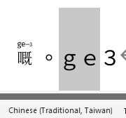
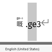
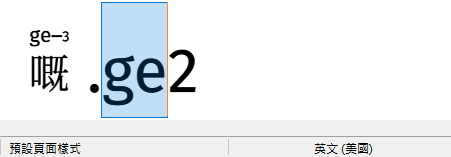
Just another idea about the possible workaround for Windows users:
Maybe using full-width Latin letters? It seems that Microsoft Word and LibreOffice Writer can treat full-width Latin letters as Chinese (see the language shown below). :thinking:

Windows / Microsoft Word:

Full-width
圖片
(Microsoft Word switches a full-width full stop to 句號 automatically.)

Half-width
圖片

Windows / LibreOffice Writer

Full-width
圖片

Half-width
圖片

That is a good find. I can add support for full-width characters. Let me see to making that into 2.6, and then put together some docs about how to type/convert full-width characters.