Cantonese Font v2 - Development Roadmap & Status

[WIP]

Bug Fix Needed

  • :white_check_mark: insert CJK punctuations into base (2024-02-07)
  • :white_check_mark: find a way to fix mixed alphanumeric / CJK scripts with correct metrics (2024-02-07)
  • fix incorrect coda coloring for [aeiou]
  • :white_check_mark: re-do default character pronunciations (2024-02-20)
    :white_check_mark: re-draw tone glyphs with more principled method (2024-02-20)

Missing features

  • :white_check_mark: add | \ as zero-width non-joiner marker (2024-02-07)
  • :white_check_mark: add 1,000 成語 sorted by char grade (2024-02-20)
  • :white_check_mark: add 300 歇後語 sorted by char grade
  • add China provincial maps
  • :white_check_mark: add En-Zh dictionary
    • :white_check_mark: from v1 (2024-02-22)
    • :white_check_mark: additional 1,500 (2024-02-22)
    • :white_check_mark: admit inflections and conjugations (2024-02-24)
  • :white_check_mark: add Zh-En dictionary
  • add 易經符號
    :white_check_mark: added standalone tone marks glyphs, to be accessible in 2.0.22.1 via {tone 1} syntax. (2024-02-20)

Aspirational investigations

  • :white_check_mark: GPOS and GSUB based non-show, for [文字 class] (in-progress from 2.0.21.0 / 2024-02-07, completed 2.0.21.1 / 2024-02-08)
    :white_check_mark: introduced wild-type [n] type of word-formation mechanisms (2024-02-20)
  • :white_check_mark: no-jyutping font variant (2024-02-26)
  • :white_check_mark: GPOS-based cartouche for word boundary visual markers
  • GPOS-based squiggles / dot-emphasis
  • :skull_and_crossbones: investigate COLR export not possible to do with CJK font due to glyphs upper-bound

2.0.20.3 (2024-02-07)

  • :white_check_mark: insert CJK punctuations into base
  • :white_check_mark: find a way to fix mixed alphanumeric / CJK scripts with correct metrics

Details

Problem

  1. As Fira Sans provides the base glyphs and metrics, it does not contain any CJK glyphs or punctuations. I build only CJK glyphs, so punctuations remain missing. When users asks for these glyphs, either a Latin CJK from Fira Sans or a from a fall-back sans-serif font was displayed.

  2. With the jyutping occupying top 1/3 of the full baseline-ascender, the CJK glyphs are smaller. Mixing alphanumeric-CJK glyphs becomes impossible without manually scaling down the non-CJK glyphs.

Solution

  1. CJK relevant punctuation glyphs were imported from Noto/Source.
  2. all non-jyutping containing glyphs were scaled down to 65% of their original sizes, using the baseline as the origin.

2.0.21.0 (2024-02-07)

  • :white_check_mark: add | \ as zero-width non-joiner marker
  • :white_check_mark: GPOS and GSUB based non-show, for [文字 class]

Issues

This is part of the work towards a Cantonese markup.

To do correct typesetting (e.g., in LaTeX), we need access to information beyond a string of characters. “我個英文老師叫陳大文” is inadequate; it needs to provide

  • correction for 文 as man4,
  • word segments (for informed line-breaks),
  • name tagging so it can be underlined

Solutions

For single markers, a simple sub ... by ...; rule suffices.

Tags are handled with opening tag [ replaced with a zero-width non-joiner (200C).

The closing tag follows the format of space tag].

My initial approach was to define glyph classes for alphanumeric, then add enough of them to cover lengths of 1-16 characters tags. That turned out to be a baaaaad idea.

During compilation, fonts explicitly generates the possible combinations. In this case, for the last rule, it needs to prepare (26+26+10+2)^16 = 8 E +28 rules. Nope, didn’t work.

It turns out that, being an expansion, the expanded form also needs to observe the 64k char rules for lookups, so practically ~3,000 rules.

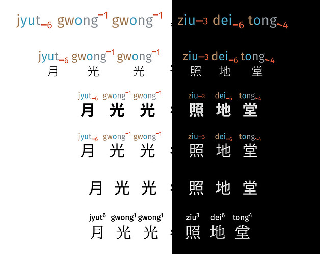
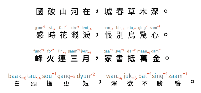
The plain-text in the lowest row corresponds to the rendered line just above. Gratifyingly, the “invisible markup” concept works overall.

New thinking as a result

The set of tags need to be carefully thought through. I am favoring a structure of

[CJK xxxx nnn], interchangeable with [CJK nnn xxxx]
[CJK xx nn], interchangeable with [CJK nn xx]

Where:

  • x is a lowercase alphabet with a special meaning (not all 26!), and can support up to 4 2 of these alphabet tags;
  • nnn is a 1, or 2, or 3 digit number. I think this can be used as a ID for referencing elsewhere (e.g., translation).[^we cannot have 3 digit numbers, which would by itself be 1,000, and is compatible only with 3 choices of single x]

What needs to be enumerated are:

  • [CJK xxxx nnn] [CJK xxx nnn] [CJK xx nnn] [CJK x nnn] [CJK nnn]
  • [CJK xxxx nn] [CJK xxx nn] [CJK xx nn] [CJK x nn] [CJK nn]
  • [CJK xxxx n] [CJK xxx n] [CJK xx n] [CJK x n] [CJK n]
  • [CJK nnn xxxx] [CJK nnn xxx] [CJK nnn xx] [CJK nnn x]
  • [CJK nn xxxx] [CJK nn xxx] [CJK nn xx] [CJK nn x]
  • [CJK n xxxx] [CJK n xxx] [CJK n xx] [CJK n x]
  • [CJK xxxx] [CJK xxx] [CJK xx] [CJK x]
  • [CJK]

The next version 2.21.1 will attempt to put this in action, as well as provide a PEG implementation for parsing the dry and hydrated markups.

The current “useful” tags are n (name), b (book), e (emphasis). We’ll finesse when more is encountered/needed.

2.0.21.1 (2024-02-08)

:white_check_mark: Implemented all combinations of [CJK xx nn] and variations

With this update, you are now able to provide up to two of the following tags:

  • b for book
  • n for name
  • e for emphasis
  • x for strike-through

With an optional numeric ID from 00-99.


Accompanying PEG grammar is stalled; it is not clear how unicode ranges are to be written. It may be an upstream issue with implementation in the Elixir Pegasus PEG → Nimbleparsec library.

    Segments          <- Word Space* "|" (Space* Word Space* "|")+ Space* Word
                       / Word Space* "|" Space* Word
                       / Word

    Word              <- NoTag
                       / Tagged

    NoTag             <- (CJK)+
    Tagged            <- "[" Space* (CJK)+ Space* Tag Space* Integer Space*"]"
                       / "[" Space* (CJK)+ Space* Integer Space* Tag Space*"]"
    
    CJK               <- CJKchar
                       / CJKchar "." Jyutping

    CJKchar           <- [\u3400-\u9FAF]
                       / [\u20021-\u2F8A6]

    Jyutping          <- [a-z]* [1-6]
    Tag               <- [a-z]+
    Integer           <- [0-9]+

    Space           <- ' '

Note that the above is constructed up to a single phrase level, and not taking punctuations into account yet (full width / CJK specific / normal punctuations are all over the place).

Progress on PEG parser blocked

Pegasus does not do Unicode, and asks to do byte-by-byte matching. It seems to have a faulty implementation of escape sequences, however, and it is not possible to match on octal / hexadecimal byte values. Progress on the parser is now blocked, and awaits response from Pegasus’ author.

I started on an alternative parser based on RegEx and functions, but I think that is an ill-advised attempt, and make it difficult to port to other languages.

2.0.21.1 B&W (2024-02-09)

This is a proof-of-concept build where SVG layers are removed. The file-sizes dropped down from 214 Mb to 33 Mb (!)

The colored versions, unlike v1, was reported to be completely not usable (need details) in Windows.

MacOS/Adobe Illustrator remains buggy; it renders standalone glyphs but not ligature glyphs.

InkScape renders B/W version correctly, but sizes the colored version incorrectly with correct metrics but colored SVG occupying a small area.

As a release strategy, all versions should be accompanied by a B/W release; this maximizes compatibility and is useful for people who don’t care for colors.

2.0.22.0 (2024-02-20)

This is the first step in a large update that is intended to resolve

:white_check_mark: single character default corrections (from manual inspection of most frequently used 6,500 characters)
:no_entry_sign: not yet propagated to word level patches
:white_check_mark: introduced wild-type [n] type of word-formation mechanisms
:white_check_mark: re-draw tone glyphs with more principled method
:white_check_mark: set language tags for ZhS and ZhT. This is required for MS applications, which reads the tags instead of scanning for glyph availability.
:dizzy: building with I.Ming, with character multiples 1.5 and no SVG translation this becomes a version for large number of testers… can’t have missing glyphs from base set
:dizzy: building with Chiron Sung, with character multiples 2 and -175 SVG translation
:white_check_mark: added standalone tone marks glyphs, to be accessible in 2.0.22.1 via {tone 1} syntax.


Chiron Sung

Sung have more complex paths, and the SVGs are slightly larger. The import of 3,000 glyphs / batch no longer works :sob: Just how horrendous does thus needs to be??

Re-draw tone glyphs to be more principled

Previously the tone marks were drawn “by eye”, and there were discrepancies in number sizes, and horizontal placements of the marks. The new drawing uses the metrics / characters internal to Fira Sans systematically; tone numbers are slightly larger (previously ~64%, now 71.4% (5:7)).

Some of the design decisions from now and before:

  • tone mark 1 is equal to cap-height
  • tone mark 2 starts at x-height and ends at cap-height
  • tone mark 3 is an imaginary mid-line, half-way from x-height and baseline
  • tone mark 4 starts baseline and ends at descender
  • tone mark 5 starts baseline and ends mid-line
  • tone mark 6 at baseline
  • the overall area of the tone marks is preserved; the mid-point of 2, 4, 5 is equal to the thickness of 1, 6
  • tone mark 3, the “natural tone”, is usually also voiced a little longer. This is represented as a slightly longer mark (and to preserve the area, slightly thinner).
  • cleaned up path shapes

The SVG import was messy, and lots of manual fixing happened (including a 125% scaling to match the original intent). Some “fix after seeing it in action”:

  • aligning tone mark 1 with dot of i instead of cap-height
  • increased LSB for -6

The final result is shown below:

It is possible that I will (less principly…) shift tone mark 3 up, to create more visual distinction from tone mark 6, and reinforce the 陰陽 distinction.

Wild-type numeral formation

This was a good play!

2.1.0.0 (2024-02-20)

:white_check_mark: idiom collection 成語匯集

Idioms

The Canto Font aspires to being a cultural and pedagogical resource, in addition to that of a linguistic tool. To that end, it uses the {keyword: n} syntax to access a trove of data.

The previous update added the {tone: 1} syntax to access the standalone tone-marks. This update adds idiom support.

In 2.1.0.0, I hand-picked 1,080 idioms that are in broad general use, and sorted them by character difficult. “Character difficulty” is a score composed from:

  1. the grade-level that a student would encounter the character in the HK education system, and
  2. the number of strokes

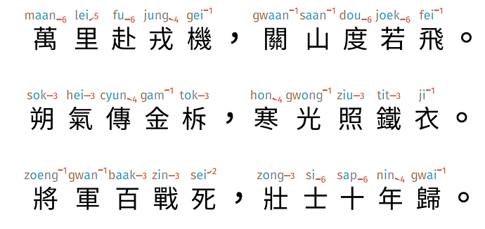
The picture shows the first two, middle two, and last two of the idiom collections.

The idioms can be accessed with either {idioms: n}or {成語: n} where n is an integer id between 1 and 1080 (inclusive). This ID is NOT fixed at the moment as the collection is subjected to critique and addition/removal.

(It may be in the cards to provide some learning material for each of these… or a bilingual book. :thinking:)

1 Like

2.2.0 (2024-02-22)

:white_check_mark: English → Chinese translation

This version added a substitution pattern from English to Chinese, with a dictionary size of about 4,000. These are accessed by simply enclosing an English word with {word} mustache braces.

The top 2,200 were manually vetted entries from v1, and the next 2,000 less-frequently used entries from Google Translate and awaits human love and care. I’ll set up a new thread for work on that.

The next minor version will bring the equivalent feature from Chinese → English. Once the English edition is stabilized, we can use that to prepare other language editions.

The slightly messed up thing here is that I am edging towards the upper-bound: the font is sitting at 62k glyphs, and there’s only about 3,000 left for play. With 2,000 allocated to Cantonese slangs/sayings, we’ll need to be very careful about how to spend the final 1,000 slots.

(Because of this hard limit, it is also not possible to have multi-lingual versions: we will have to do with separate editions, perhaps with English fall-back for, say, MTR stations.)

2.2.1 (2024-02-22)

:white_check_mark: Chinese → English translation

This minor version added the backward capacity as that introduced in 2.2.0. This translation capacity is accessed by enclosing a Chinese word with {字詞} mustache braces.

When the translation corpus is edited, we should keep in mind the needs of going backwards to English. This probably needs the eye of testers who regularly work with learners and are aware of their needs.

2.2.2 (2024-02-24)

En → Zh translation now accepts plurals for nouns, and conjugations for verbs. A brief description of this work can be found here: Font-embedded “Translation” – jon.hk

2.3.0 (2024-02-26)

:white_check_mark: No Jyutping font variant

A font variant with no jyutping is now available. This is available as a second .ttf file; when it is installed, a sub-font can be selected in a drop-down:

image

For convenience I have mapped this as a (pseudo) Italic, which can then be accessed by cmd-I keyboard short-cut.

This makes it possible to prepare mixed Jyutping / no Jyutping texts, showing jyutping only when necessary. This in turns expand the user-base from entirely new beginners (who need every Jyutping) to intermediate-advanced learners who may need Jyutping in 10-20% of the text.

These are essentially two different fonts, and it is very difficult to get all the metrics right. There are some off-setting, generally proportional to the length of the Jyutping. I think this can be resolved, but not in a straight-forward way. [TODO]

As the relationship between two fonts are declared as Italics, in HTML the <i> </i> tags will toggle off the Jyutping. This in turn enable us to programmatically generate, say, every grade-level specific versions for every text via CI/CD of the repo.


With this we are close to a feature lockdown. The only remaining content are dictionary of

  1. Cantonese grammar,
  2. Cantonese slangs,

And perhaps a Spanish version of the dictionary.

My attention will shift to documentation, esp tutorials, and full-court press at marketing this very strange artefact to users.

2.4.0 (2024-03-05)

A bank of classifiers / measure words / 量詞 have been added to Pokfield. These can be accessed using one of the following syntaxes:

  • {measure: n} (n = 1…111)
  • {classifier: n}
  • {量詞: n}

The examples can be accessed by appending an ex before closing the braces, for example, {measure: 23 ex}, whereas the brief explanations (does not replace consulting a book or a teacher!) can be gotten to by appending a ? before closing the braces, for example {measure: 23 ?}.

At the moment, the data is very much proof-of-concept. The bank is quite comprehensive, but the ranking is meaningful only up to the first 25 or so. This awaits a more rigorous frequency based treatment. Someone with better Canto linguistic understanding can contribute more careful re-writing / examples.


Substantial efforts were made between 2.3.0 and 2.4.0 for extended compatibility. This included investigations into COLR format, and addition of language codePages to the OS/2 table for Microsoft compatibility.

COLR is blocked on principle. COLR works by decomposing each color into its own layer, and these layers are each assigned their own glyph. For 38,000 char x 5 colors / char, this expands to well beyond 65k. For color fonts there is no choice except for OT-SVG.

Addition of traditional/simplified codePages to the OS/2 table improved Microsoft compatibility; on Windows, the font family name must additionally be short (??) in order for the Cantonese characters such as 嘅 to not be switched to some default font.

Export to (monochrome) .otf seems to be necessary for usage on Kindles.

2.5 (2024-03-06)

This version is a major milestone, folding in four sets of changes:

  1. all known pronunciation updates (char, words)
  2. the full series of bold, standard jyutping, and no jyutping; in 黑體 as fixed width
  3. adopting a fluid-fixed width effect
  4. invisible to users, 2.5 uses a new importing procedure. This no longer causes memory bloat / crashes.

2.5 is release-ready and is the first version to take on the VF Cantonese name.


1. All known pronunciation updates.

See separate post about updates to default readings. All compounds from previous default reading updates are now patched.

2. Full series

VF Cantonese includes three font variants that share compatible metrics. These include bold, standard, and no jyutping. All three support mixed scripts / Latin and CJK punctuations, and takes on application color.

3. Fluid-fixed width

This encompasses two sets of changes.

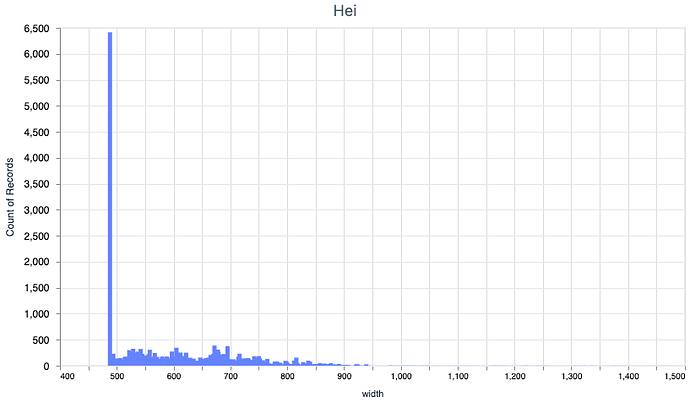
First, the inter-character spacing in 2.4 Fixed Width was set to 900, which I thought was too much white space. The new character widths are 860. About 90% of the glyphs fall under this mark.

This creates an issue for the glyphs wider than 860, as neighbor wide glyphs will clash against one another in the Jyutping. This was resolved by classifying the characters into four kerning groups:

  • < 860 (narrow)
  • 860–1050 (medium-wide)
  • 1050–1200 (wide)
  • larger than 1200 (SUPER; these 31 glyphs are all bisyllabic)

This creates 4 x 4 = 16 (symmetric) kerning pairs, and these were assigned a specific kerning that minimizes the chances of clash. The effect is very nice and natural, and it totally doesn’t seem like it took so much work to get just right.

I think this, in some way, captures exactly the overall feel and why I felt right to christen this VF Cantonese. At least on CoreText rendered systems, the fonts “just work” together like a normal font, supporting all the features one expects from a font. The horrific details are hidden so well that it looks effortless.

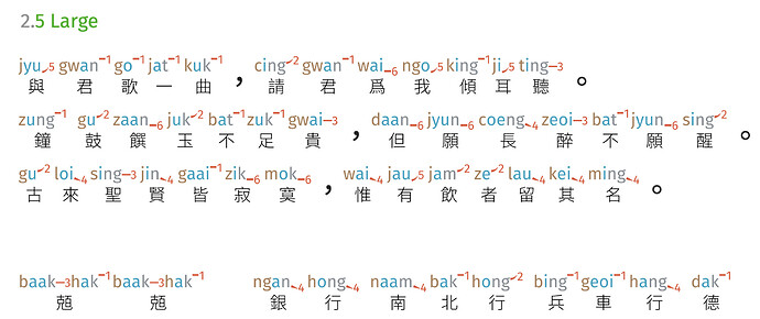
The Large Jyutping font variant is an addition to the 2.5 set:

It combines over-sized Jyutping with a light Chinese text, in a fluid layout, to give a easy starting point to beginners, or learners who are primarily interested in speaking and listening.

The Heritage font variant is also added. This uses 1.Ming as the base font, with no tone marks and only superscript positioning of tones.

2 Likes

2.6 (2024-03-25)

This version sees little changes from most users’ perspective, but has undergone major house-keeping and bug fixes. Notably:

  1. Perfected pragmatic fixed width effect,
  2. Perfected No Jyutping shared metric with Regular/Bold varieties,
  3. Keyboard shortcut available for the perfect metric No Jyutping
  4. Cleaning up zero-width non-joiner,
  5. Bodies for phantom glyphs,
  6. (experimental) Private User Area codes (UE000 onwards) for Regular.

For users, there is a new Only Jyutping variant, for a total of six available variants (available to the Lab program supporters).


Pragmatic Fixed Width Effect

2.5 distinguishes between four classes with different widths, and kerns this cross of 4 x 4 = 16 with different widths. Within each class, the characters may be up to 15% wider.

2.6 keeps the fixed width for the 93% of “narrow” characters (36,631 / 39,424) but fits individual widths for the remaining 2,793 characters. These “wide” characters thus takes up only as much space as is necessary for itself.

All-in-all this is a very interesting and important solve to the “ugly Jyutping-annotated text” problem that I’ve been chasing down for two years, and I’ve started a blog post on its evolution. From the user’s perspective… it just looks nice, natural, and rhythm-preserving. “Do nothing” is hard.

No Jyutping

The No Jyutping variant had been very difficult to get right. It is technically a different kind of font (monochrome, not OT-SVG), and must perfectly match the metrics of layers in other fonts, one of which is an SVG layer in which there isn’t much metric to extract.

This is now done (dare I say) perfectly; the Jyutping can seemingly be toggled with keyboard shortcut of cmd/ctrl-I (this greatly improves the ergonomics), with minimal visual glitching. Note that Chinese characters here are not overlapping over the Jyutping variants; since No Jyutping has no jyutping, all characters are fixed width and creates slight narrowing for the 7% or so “wide” characters.

ZWNJ / phantom bodies / PUA

Microsoft renders some width for the zero-width markers. The zero-width marker paths have thus been removed. It does not seem to regress on CoreText or VectorStyler, but no longer displays a bar on Microsoft renderer.

Phantom bodies were added to ligature glyphs to appease Adobe font renderers. This does not serve the goal; Adobe font renderers performed the first substitution (into the phantom glyph) but fails to apply the second rule out.

Significant work (with help from @k.k) went into trying to make .jyutping override work on Microsoft shapers. This included making three additional set of rules where full-width characters were also accepted, in attempts to help the renderer NOT break the ligature up into separate runs. None of the attempts worked.

On the Regular version, Private Use Area codepoints were assigned for non-default Jyutping glyphs. This allows Windows users, in theory, to pick out a specific glyph from the Character Viewer. PUA are fundamentally problematic and should be avoided if possible; one of the issues here is that the codepoints are version-specific, and may refer to an entirely different character in future versions. It is far, far better to simply label with .jyutping (even though the ligature doesn’t process), and get a Mac user to Print to PDF for you.

Only Jyutping variant

An Only Jyutping variant had been introduced to the family. This serves teacher/learners that do not wish to be concerned with Chinese glyphs whatsoever, or as a less intimidating entry point to beginning learners.

It is uncanny to dictate Cantonese and get only Jyutping back out. And then to switch font variant and have the Chinese text appear magically.

Development

  • AWong had completed a jieba-rs binding to Elixir, and I have prepared Yue-specific dictionaries for their use. The weighings have yet to be tuned, but this is generating performant, concurrent-possible segmentation with reasonable accuracy (approximates human segmentation, though not that of an expert human.)

  • I have written the first half of the tooling to take some text, and convert it to a Json with correct Jyutping consistent with how the font behaves. We are close to non-font custom applications that achieves parity with the font.

2.7 (2024-04-05)

This release candidate have the following changes:

  1. g in Jyutping has new glyph (non looptail),
  2. Pragmatic Fixed Width sees fixed spacing decrease by 10%,
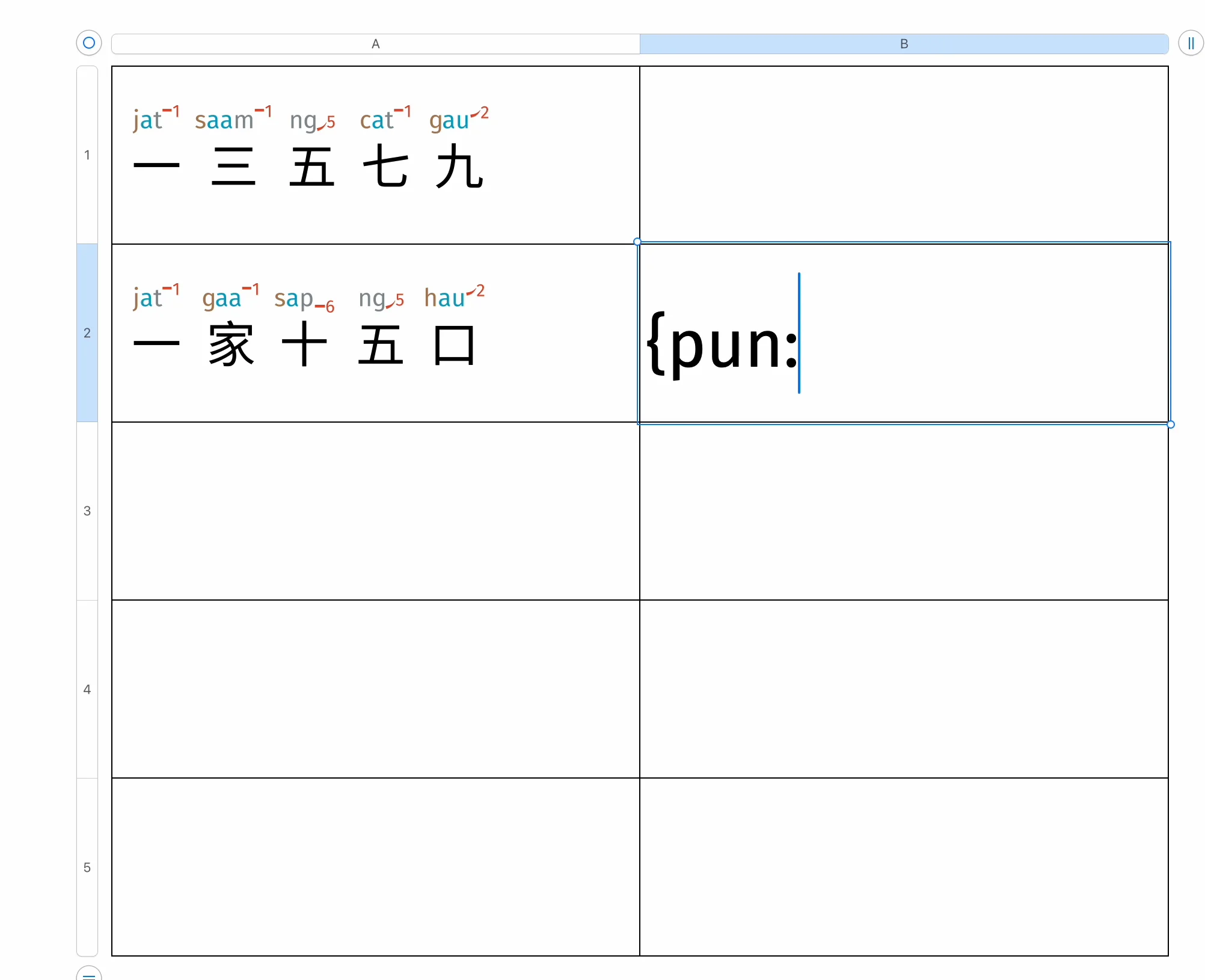
  3. 歇後語 bank added, callable with {pun: n} and {pun: n ?} for the two halves
  4. markers, callable with {marker: n}, or short-hand {n}. Closes with {-n}
  5. one new glyph
  6. alternative .jyutping entry

Drawing of g

In previous versions, Jyutping g was drawn with a looptail. @grapheme suggested that for phonetic usage, “g” should use a non-looptail variant. I agree with the clarity, and re-drew the half-million glyphs for the full-set.

Fixed width tuning

I continued the fine-tune of the spacing between characters.

Previously the fixed width was set to “contain” ~93% of glyphs, with the remaining 7% floating. This comes to about 1.8 inter-char spacing. Using CSS letter-spacing as a tool to quickly investigate the readability, I decided to make the fixed width slightly narrower. This creates more occasions for slipping and larger slipping effects,

But on the whole preserves the equal distance rhythm:

歇後語 Sandwich Puns

A bank of 425 “sandwich puns” is added, and the front/back halves are available with {pun: 123} and {pun: 123 ?} respectively. The usage of ? as an explanation marker is in line with the usage in measurekeyword.

Instead of pun, the 歇後語 keyword can also be used.

Call-outs / markers
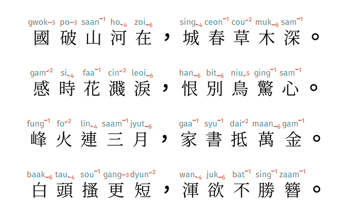
This is a feature that had been around since 2.5 but was unannounced. Teachers often need to point out one specific word/character, and resort to pointing; during creation of critical/parallel editions, the writer may wish to annotate the parallel words, or provide a gloss on the side-bar.

The {marker: 1} syntax now inserts an numbered opening tag; this is available also with the shorthand {1}. The shorthand {-1} closes the tag. Fifty tag-pairs are available.

Alternative .jyutping entries

Some users may be typing with a Chinese Keyboard IME (Cangjie/TypeDuck etc), which automatically replaces the period . with a CJK period . The OS/IME may or may not also change the alphanumeric characters to their full-width equivalents. (h/t @grapheme.)

In 2.7, .jyutping syntax can use CJK period instead of a normal period. If a CJK period is used, then full-width alphanumeric may be used. This provides a convenient entry for users who are typing corrections at the same time as their CJK, without needing them to switch language.

2.7 experimental variants

With 2.5 being in the hands of testers / early access for six weeks, I’m now quite confident that the base style / glyphs can be locked in, with the only changes on the font features level (additional words, and everything to do with the {keyword} syntax).

While the process is fresh in my mind, I’ve gone to build out the scaffold for… many variants. Almost all of them needs to be tuned and tested, but their existence give me confidence to promise additional font variants (that plays well together).

Here’s a look at what might one day be available:

Heritage

This is based off Ichiro 內木一郎’s 一點明體, and follows the letterforms of traditional print. It is unique amongst the Canto Fonts that it does not have tone-marks, and instead follows the official LSHK style.

HKEdB

This is based off a font whose name can no longer be pronounced. The font was seemingly made by individual elderly being trained to draw outlines; the great advantage is that it supposedly conforms to the HK Education Bureau’s pedantic, not-very-correct glyph forms.

The disadvantage is that it has a very small number of glyphs (4,700), and the glyphs don’t work together as a whole. The center of gravity is all over the place. This cannot be fixed unless / until someone go in to redo the base-font, which is a large investment of time and expertise.

Jyunsai

Jyunsai is based off Klee One, and is a clear handwritten style esp suitable for learners also learning to write. This open font has a broken Bold encoding and the full series will await someone (maybe me) recreating the Bold variant.

Sung series

This is closest to actually working, and will probably be the second series to land in the Lab around Sept.

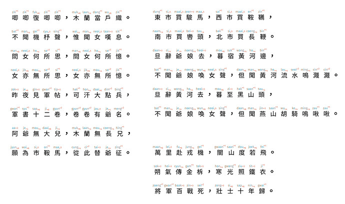
Hei series

This is fully ready and will be in the Lab at launch.

Only Jyutping

Only Jyutping is a little hard to read (and a good reminder for the teacher just how hard it is!) It serves a particular group of learners/teachers.

2.7 (2024-04-20)

Final particles

I’ve added a bank of final particles; on the single characters it’s (quite) comprehensive. These can be accessed as {final: n} and {final: n ex} for the examples.

Minor edits

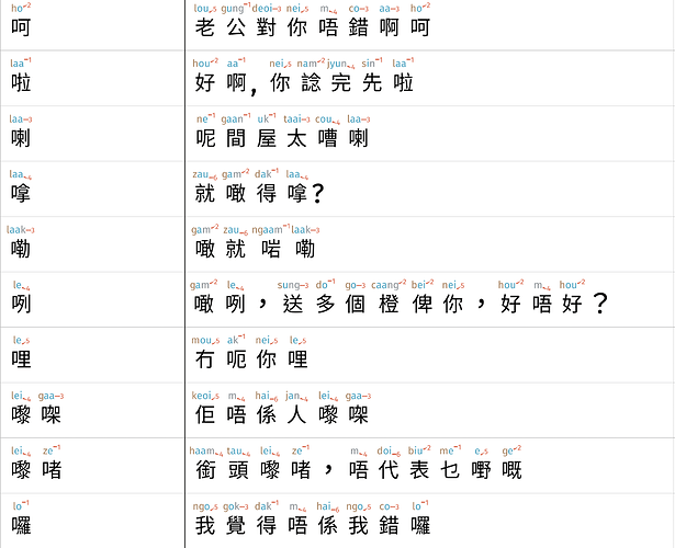
Working on the final particles put me in hyper-alert listening to Cantonese uses. I’ve added some “this definitely isn’t found in the dictionary” Jyutping for certain characters. I am particularly proud of this example sentence from the final particles:

These me-e / ze-e are very commonly found, and I think it is quite important that teachers / parents are equipped with tools to express them.

Docs

Much of my efforts have shifted to the documentation. There’s still a long way to go. A tutorial (available inside the release) is available as both an exercise keynote file, along with explanation at docs.visual-fonts.com and tutorial videos.

1 Like